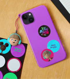
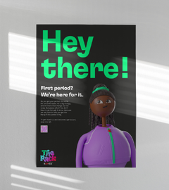
Kotex: The Pack
Description
The Pack by Kotex was designed to revolutionise menstrual health education in South Africa. I was lead designer, working closely with the client, visualisation team, and typographer Dan Forster.
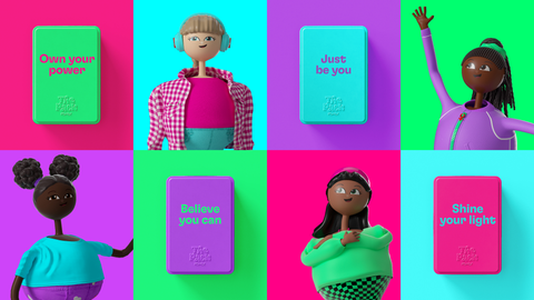
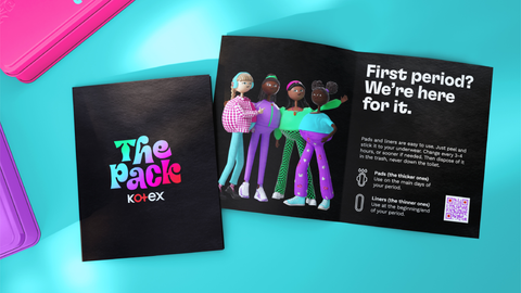
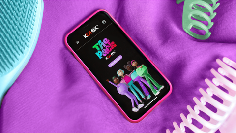
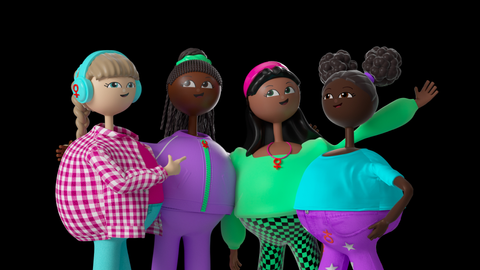
Starting with the consumer desire ’Edu-tain me’, The Pack transforms menstrual education into an engaging, empowering experience. It also fosters a sense of community and unity, representing all voices.
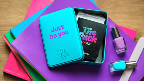
The brand name itself is both metaphorical and literal. It represents not only the relatable characters guiding the girls, but also the physical kit equipping tweens with their first menstrual items. This reusable tin is designed to be sustainable and durable.
Awards
- The Drum Awards Silver for Branding
- Pentawards Silver for Health Care, Shortlisted for People's Choice Award
- Brand Impact Awards Bronze for Education, Shortlisted for Social Impact
